Identity and UI Design
Profesh

Profesh is a start-up that connects young employees with prospective employees using short-form self recorded video applications.
Think Bumble 🤝LinkedIn.
This was a very interesting and open brief, as all we were given were the name and the concept of the app. The rest was left up to us. We spent a lot of time researching as well as coming up with many concepts for the design language and story - finally landing on the metaphor of the butterfly.


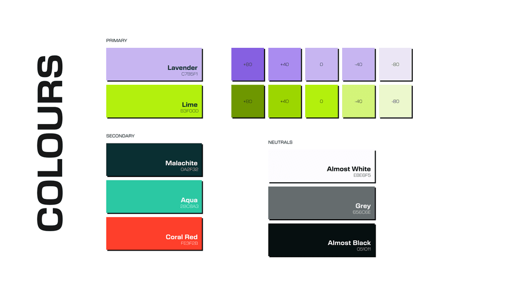


The butterfly not only symbolises change and development in its journey through the chrysalis, the symmetry of its form symbolises both sides of the journey Profesh would take its clients through (plus points to us for the butterfly effect easter egg).


After locking on a logo and design story, our next steps involved designing the UI language for the app. We didn’t hold back and created designs that could break through the minimal/clean aesthetic trends that have taken the professional space by storm.
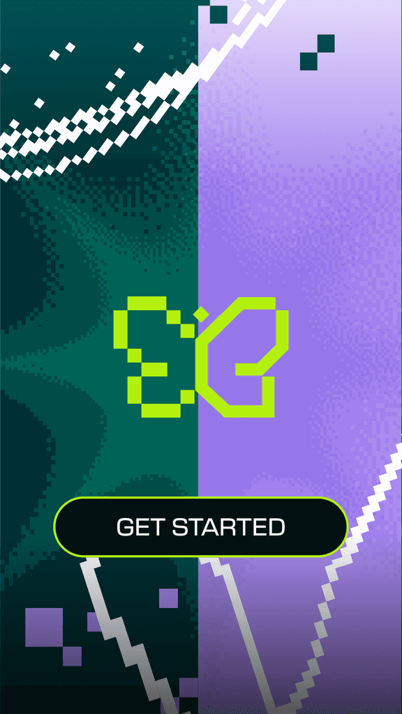


Swipe to see a simplified version of the user flow!